Why do some printed materials instantly feel premium, trustworthy or bold, while others barely get noticed?
It may surprise you to learn that more often than not, the answer lies in your chosen colour palette.
In print design, colour plays a critical role in shaping those all important first impressions. Before someone even reads your headline, they’ve made a snap judgement based on how your piece looks and how it makes them feel just from that first glance. Done right, and print will bring you a unique advantage over your competitors. Get it wrong and it could be a costly mistake.
At The Ark Design and Print, we specialise in helping our clients to create stand-out marketing products by using colour intentionally. Whether you’re promoting a high-end venue, launching a campaign or sharing an annual report, we will work closely with you to make sure your print not only looks good but also lands well. Let’s learn a little more about the role of colour psychology in print marketing...
With the colour you opt for, you set the tone for everything that follows. It helps your audience to decide, often subconsciously, whether to trust you, listen to you, or act on what you’re saying. The right colour choice within your design will instantly spark an emotional response, leading to sales and bookings.
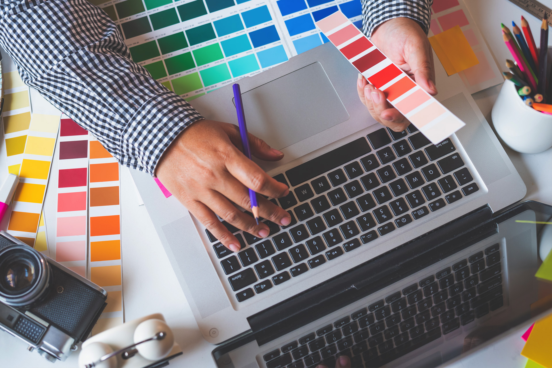
A big part of our role is to find colours that will align with your business goals and brand identity. That means thinking about your brand’s voice and imagery, your audience’s mindset and how your material will be used and/or distributed. It’s part design instinct, part audience psychology, and part knowing how colour is perceived on different stocks and finishes.
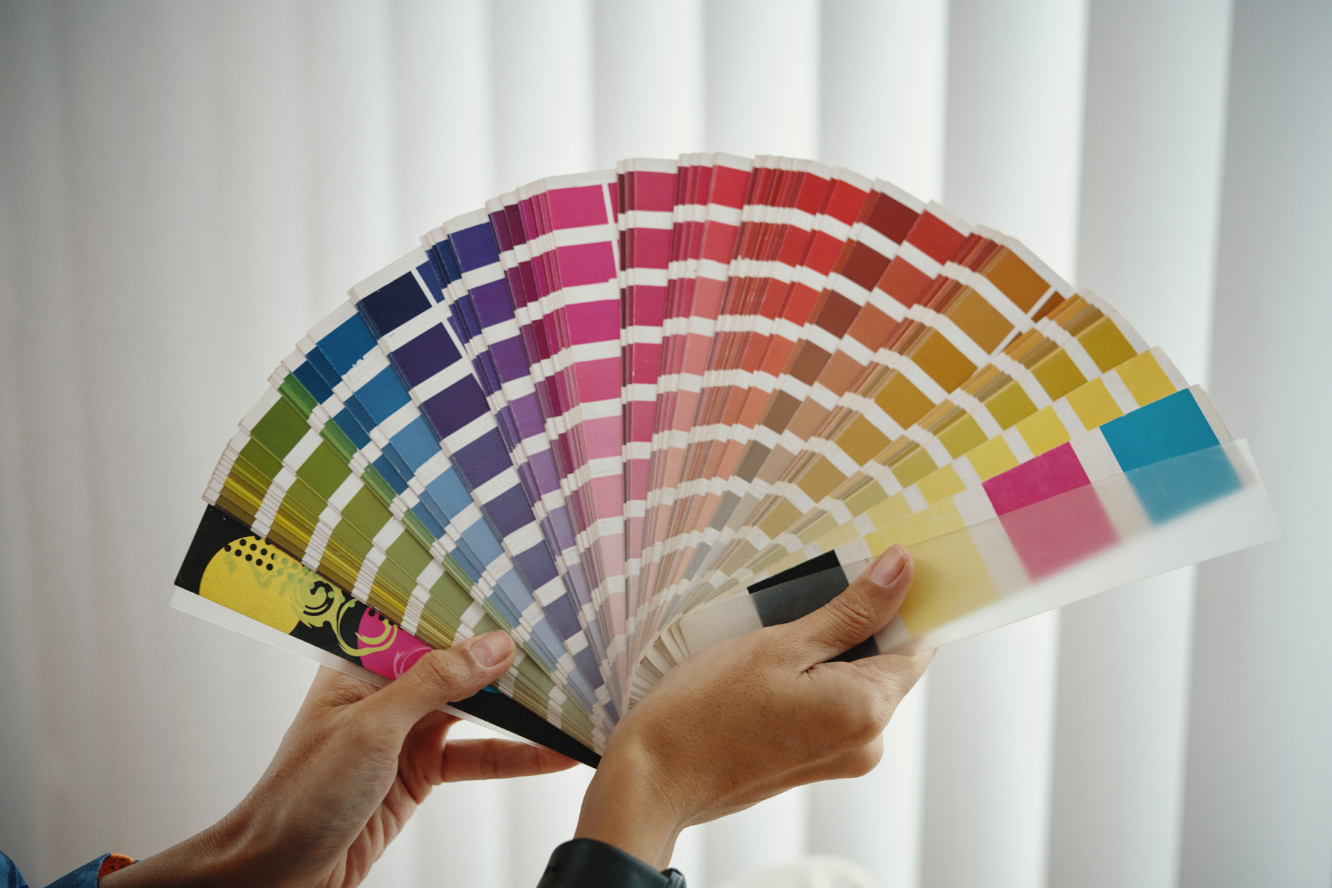
Colours speak to us all. Everybody has a favourite colour or particular shade they are drawn to, ones that resonate, calm us, spark memories and so on. But our connection with colours can go even further. Many of us can instantly recognise a brand simply from their colour usage within their logo or other marketing creatives, and there’s a reason for this: Colour Psychology. Let’s take a closer look at what some of the most commonly used colours can mean when used in the world of print:
Blue – Calm, Trust, Professionalism
Used in: healthcare, finance, education and professional services
Yellow – Warmth, Positivity, Energy
Used in: charities, awareness campaigns, youth marketing
Green – Growth, Sustainability, Wellbeing
Used in: eco-brands, hospitality, wellness and lifestyle
Purple – Prestige, Creativity, Quality
Used in: events, luxury packaging, arts and culture
Red – Urgency, Strength, Passion
Used in: fundraising appeals, emergency services, promotional campaigns
Black – Elegance, Authority, Simplicity
Used in: premium branding, fashion, formal communications
The real power of colour comes not just from the shade, but from how it’s used alongside other design elements. Tone, saturation, space, and contrast all play a part, which is precisely why when you work with the team at The Ark, we will think carefully about how the right colour combinations will come together to support your message without distracting from it.
When Weetwood Hall approached us to design their wedding brochure, they had one clear goal: to reflect the elegance and quality of their four-star estate in every detail. They didn’t want gimmicks or over-design; that wouldn’t have been the right fit for their brand. They wanted something that felt timeless, premium and personal.
Our approach began with the photography, as they have the most beautiful venue that needed to be showcased. We decided to use a muted pastel colour palette throughout the booklet to complement their images, keeping the reader focused on the setting itself rather than overwhelming them with heavy design.
To add a touch of luxury, we introduced embossed gold detailing on the front cover, giving the brochure a tactile, high-end feel that aligned with the quality of the venue. The result is a piece of print that couples will want to hold onto, and one that represents Weetwood Hall as a sophisticated, modern wedding destination. You can find out more and see the full case study here.
For Yorkshire Air Ambulance’s 2024 annual report, the brief was very different. This lifesaving charity needed a printed report that demanded attention, created trust and encouraged action. The colours in this case needed to work hard, not just look good.
We therefore decided to really lean into their strong brand palette of yellow and red, showing trust but also touching on the emergency element of this client. We then balanced the intensity with bold black and white typography to ensure legibility and structure, delivering their key messages, facts and figures.
The finished booklet looks sharp, action-oriented and full of impact. Most importantly, it tells the story of the organisation in a way that matches the energy and dedication of the people behind it. You can take a look at the finished product here.
Without that specialist eye, it can be very easy to be tripped up by colour choices. Here are a few mistakes that we often come across:
And the biggest one? Not getting a second opinion. When you’re close to a brand or project, it can be very easy to lose perspective and going over and over your own designs without having a fresh pair of eyes looking at them can lead to missed problems. Our team often spot colour clashes or tone mismatches that others have overlooked. That’s where consultation makes a real difference. At The Ark, we offer practical advice, test prints and proofing to make sure your colour choices work just as well in reality as they do on screen.
The most useful question you can ask yourself is “what do you want people to feel?” when they lay their eyes across your print. Is the message you’re going for luxurious, open, trustworthy, urgent? Every colour decision can then flow from here.
Next, think about where your print will be used. Will it be handed out at an event? Sent by post? Picked up from a counter? Context matters.
Then, test. Colours behave differently depending on the paper stock, print process and finish. What looks deep and rich on gloss might come out flat on uncoated paper. What pops on screen might feel too intense in print. Here at The Ark, we can help you to test colours so you know exactly what to expect. Good colour choices don’t happen by accident; they’re guided by insight, experience, and a bit of creative instinct. And that’s exactly what we bring to every print project.
Colour does more than complete a design. It sets the tone, shapes perception and influences response, and, in print, where people take more time to engage, it matters more than ever. Whether you're relaunching your brand or planning a high-visibility campaign, the right colours can make all the difference. Why not speak to The Ark Design and Print today for expert advice on print design that connects?!
No egos. No fuss. Just print that works.