A solid brand identity is important to any business, with 81% of customers saying that they need to fully trust a brand before they would want to buy anything from them. Studies also suggest that over 75% of people prefer to do business with a brand that they feel a connection with and are more likely to choose familiar brands over unfamiliar competitors.
That’s why pinning down your core brand identity and letting customers see what you’re about is so important.
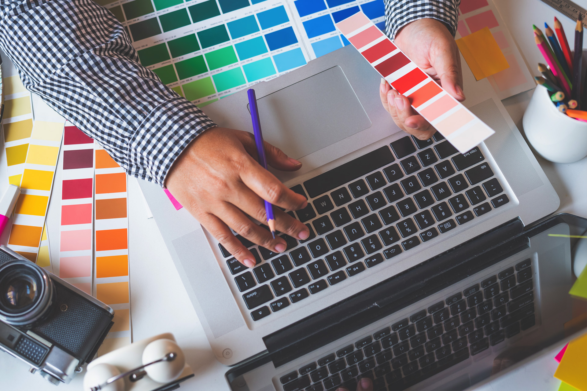
There’s so much more to branding than just designing a logo, and that’s where we can help.
Settling on a brand identity is an important step, but can also be a challenging one. There are a lot of things that can go wrong with branding. Bad branding can result in unfortunate consequences to your business, like:
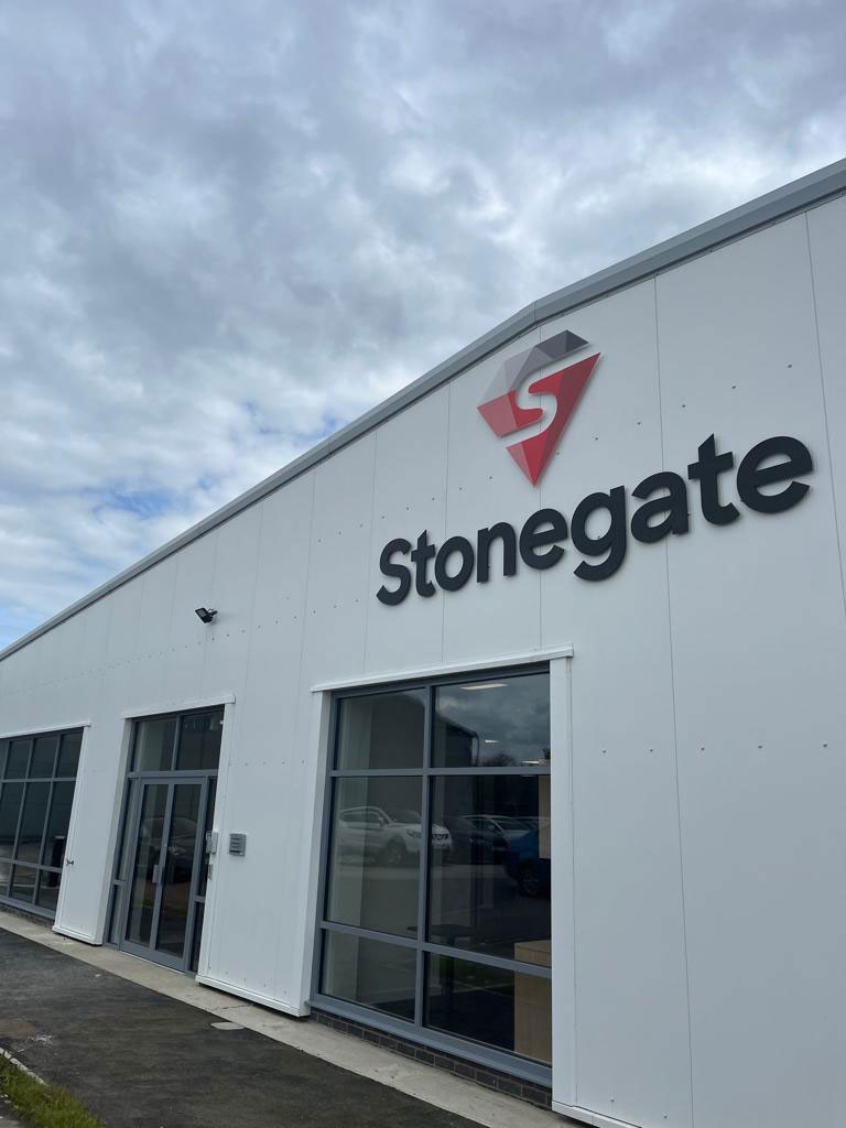
Don’t let your business be overshadowed by its competitors. With vibrant designs that keep your business’ values and services at the forefront, you can let your customers know who you are, what you stand for, and – most importantly - what sets you apart from all the rest.
There’s nothing worse than a brand that’s stuck in the past, so don’t let potential customers think that you’re ancient history. A brand that keeps up with current trends is more likely to stay relevant over time. Staying flexible also helps you connect with a range of important audiences.
A brand is only as good as its messaging, so what you have to say shouldn’t confuse your audience. No matter what it is you aim to do, we can help transform even the most complex ideas into catchy and compelling brand messages.
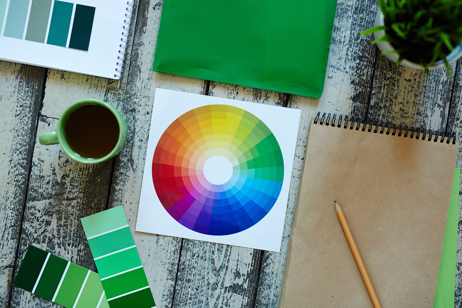
According to G2, customers make a snap judgement about your brand’s visual appeal in around 50 milliseconds. A vibrant and memorable rebrand will capture your audience’s attention, and a compelling brand narrative can make even the most casual customer come back for more.
According to 77% of marketers, good branding is essential to future business growth. We take branding strategy seriously, making sure that everything you put into it will reflect well in the future for your business. By planning your marketing campaigns in line with your brand identity, you can connect with your customers across the board.
Consistency is key to building trust with your customers and making your brand stick. We’ll work with you on a brand audit that keeps everything - from your look to your content - according to plan, so your brand feels the same no matter where people see it.
We're here to help you connect with your customers and beat your competition with top quality branding services - without the fuss.
Contact UsAt The Ark Design & Print Ltd, we create exceptional designs and printed materials that make a lasting impression. Our commitment lies in excellence and innovation, allowing us to deliver exceptional outcomes that we proudly tie our name to.

Louise Ridge
Serlby Park Academy
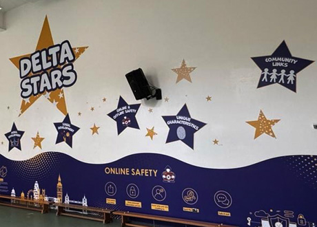
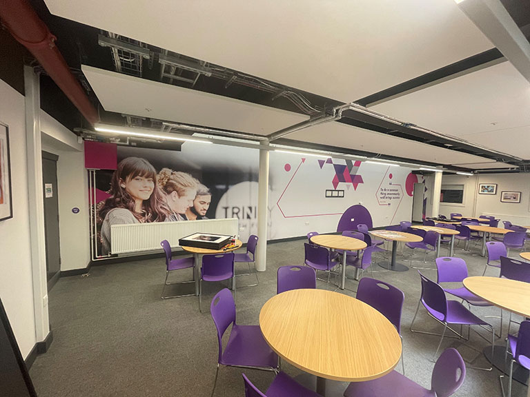
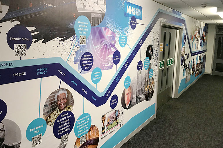
I want to say a massive thank you to you and your team for the installations in the hall and the reception area - they look absolutely fantastic and have totally transformed our environment. At lunch time yesterday the children were absolutely in awe of the display in the hall - it really makes such a huge impact.

Tom Herrick - Principal
Macaulay Primary Academy and Craven Primary Academy
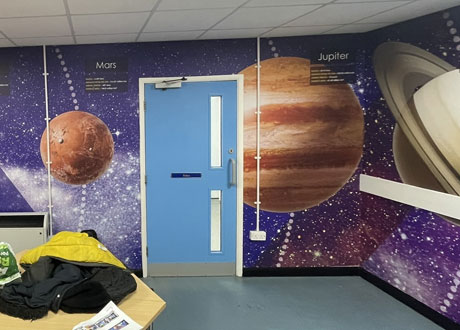
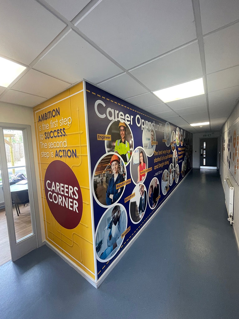
I am over the moon with everything you've done. The wall graphic looks absolutely fantastic!!! Thank you so much. The staff said the guys who came to fit it all were great and worked so well in school and just did it all around the kids with no fuss so please pass on my thanks to them too.
It's perfect and has made such an impact around school.
Thanks for all your much appreciated work on this.

Mick Whittle
Delta Academies Trust
I just wanted to thank you for the support over the years, much appreciated, it has made the job just that bit easier when you can rely on high quality contractors who are also generally good people. I thank you all and wish you well in the future.
Laura Barber
Quorum Business Park
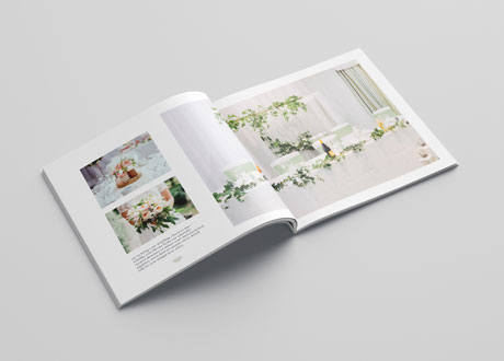
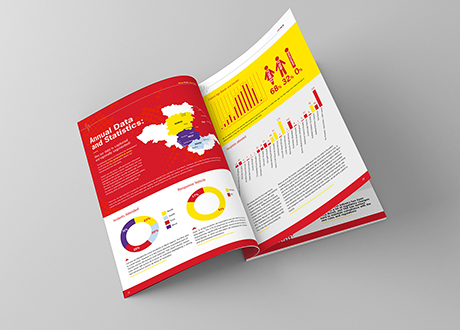
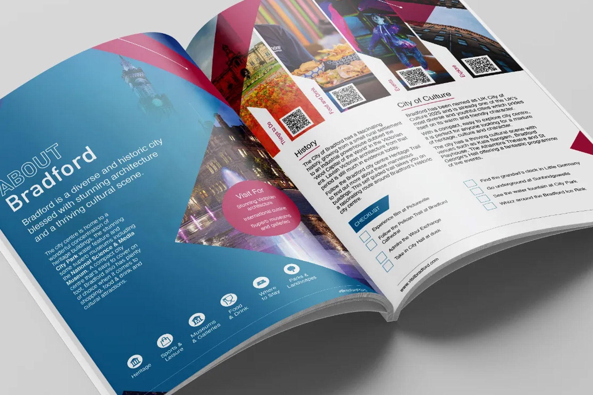
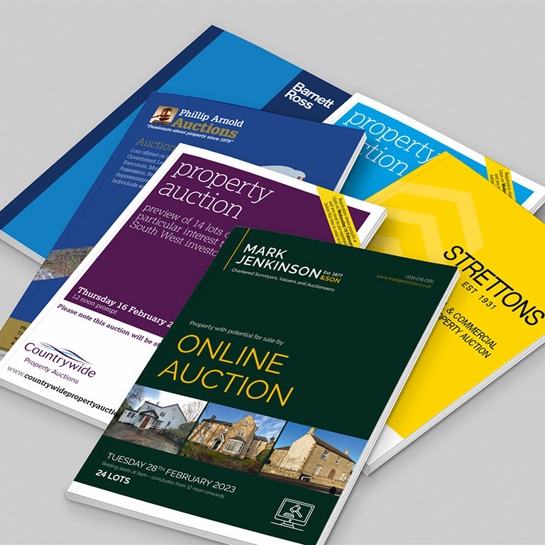
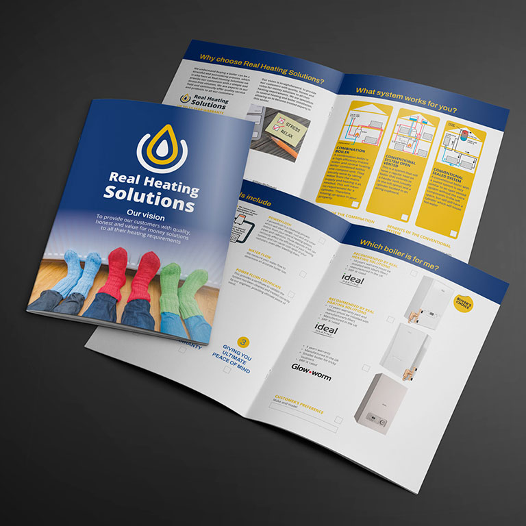
We were delighted with our new building brochures produced by the Ark. The finished products were well presented, fresh and modern. They both stuck to the brief and impressed us with ideas and innovation. When presented with a wide array of photography, the Ark selected the most effective designs and layouts and produced a fantastic brochure. We’re also particularly impressed with the print quality which combined with the excellent presentation of pictures and graphics combines to make a very effective marketing tool.

Mark Proudlove
Barker Proudlove
As a retail property consultancy, we have used the Ark to assist in the marketing of numerous shopping centre, high street and development projects. We value the quality of work consistently provided, the speed of response, and the understanding the Ark have on the work needed.

Chris Swann
9 St John Street Chambers
The Ark offer a professional, innovative and friendly service and have totally revitalised our brand image. Their efficient response and quality work have enabled our business to meet sudden deadlines and they have saved the day on more than one occasion.
Jenny Dyson
Head of Conference Projects RICS
RICS have been working with the Ark for nearly 10 years primarily designing and producing collateral for our Awards ceremonies. They are professional in their approach and always go that extra mile to ensure that we receive the best service.

James Kersh
Sutton Kersh
The Ark are consistently brilliant! With a work ethic of 'nothing is ever too much trouble', Sutton Kersh have been using their creative and innovative brain for years and they never fail to impress. They can produce quality and quantity. No matter how short your deadline or how vague your brief, this is one team that will never let you down.

We love design and print. That's why we keep our blog updated with fresh content about the latest trends and news in the industry. Stay connected for inspiration and insights that keep you ahead in the creative world.